Scotia project reveal: colorful, but make it calming
- Tara Lenney

- May 26, 2023
- 7 min read
Updated: Jun 2, 2023

Tell me if this sounds familiar. You’re a busy family juggling the demands of 3 kids. Between preschool drop-offs, snack duty, and baseball practice, you’re constantly feeling just a teeeeensy bit behind, especially when it comes to laundry. It doesn’t help that your 1975 house is systematically rebelling against you and you can’t even open and shut your dryer door, because apparently in the 70’s they didn’t need to open the dryer?!?
Despite the chaos, our clients had a vision for her home. They wanted color and life and pattern and fun! But also, with the demands of 3 young kids (and all the stuff that 3 kids bring along with them) they wanted their home to feel like a calming retreat.
Is it even possible to have both!? Vibrant and calm? Colorful and serene?
Challenge accepted.
*You can read more of this story, both from us an our client, in this article from the Dallas Morning News! *
THE BEFORE
Our client had created a few spaces in her home that she LOVED, but when it came to the big renovation, it was going to take a lot more than wallpaper and fabric to make it work. The pantry was too small, they longed for a kitchen island instead of their choppy peninsula-style kitchen, more openness to the living room, plus a laundry room where, you know, you could actually open the dryer door. Oh, and make laundry FUN.
THE PLAN

Before, the two living rooms were pretty isolated from the kitchen area, particularly the one on the left side of the kitchen. It was super underutilized and was almost a glorified hallway between the front and backyard.
We removed the built ins between the Breakfast and Living Room, took out the bay window, and straightened out the back wall of the house, letting in TONS of natural light and making things much easier to navigate. We also took that opportunity to extend the outdoor patio and create a built in banquette in the breakfast area.
In the kitchen we opened up the wall to the dining room, removed the peninsula, added an island, and opened up the stairwell (show stopping moment forshadowing).
The pantry had to go, so we relocated the food and appliance storage to the laundry room, which is now a square (hallelujah) and the dryer can finally open all the way. An old coat closet had been the culprit, so we did away with that since it wasn’t really being used.
THE FINAL PRODUCT

Right as you enter the home, you’re met with the most wildly colorful wallpaper that it’s hard not to feel cheerful. We updated the stair railings to a more modern and unique shape.

The stairwell used to empty into this hallway in a pretty unceremonious way. By relocating the small pantry, we were able to alter the landing to open directly into the kitchen. This new open view gave us an opportunity to do something special; rather than your typical wood stair treads and white risers, we opted for soft blue risers (you’ll see why in a moment) with a spectacular oushak rug moment.

The real centerpiece of this renovation (and the home) is the new kitchen. The soft blue from the stair treads is echoed on the soft blue island that took the place of the former (weird) peninsula. Now the kitchen is open and inviting.

The perimeter cabinets are painted in a crisp white, with soft off-white-almost-gray quartz counters that unify the island and other cabinets. The cheerful natural rug with a pop of pink runs the length between the island and sink.

The sink is about the only thing that remained in its original location, under this sunny little window overlooking the backyard. We updated it to an apron front and added a soft brass faucet.

This 48” gas range is a thing of beauty, and the feature our client was most looking forward to. The brass hardware on the range coordinate beautifully with the brass cabinet hardware.

One goal in nearly any home renovation is to get rid of any of these dreaded furr downs to lift our ceiling as much as possible. We had hoped this guy could be removed, but unfortunately, it wasn’t possible. We wanted to maintain as much symmetry as possible on either side of the range, so rather than have a funky short upper cabinet on the left, we opted for open shelving to create a functional display that drew your attention away from the furr down.
The tile backsplash was the one material that took the longest for the homeowners to land on. Ultimately we went with a soft white zellige tile that is a textural moment that adds character without demanding too much attention. The patterned backsplash that was there before was overly dominating the space; we were looking for more of a Best Supporting Actress to the other star of this kitchen…

THE LIGHTING.
If there is one single element in this renovation that takes the cake, it’s the light fixtures. They’re all so unique from what you typically see; feminine and sophisticated and just a tad whimsical. They add so much personality to this home.

One of our go-to moves in a kitchen is to hide the microwave. This built in drawer microwave is tucked on the working side of the island, out of sight.

In a world of islands that are as large as basketball courts, this gal is a bit more petite. At only 3’ wide, it’s enough for full depth cabinets on the working side and knee space on the other. We added a leg detail to give it a bit more presence since we couldn’t go as deep due to the size constraints of the room.

Let’s take a step backwards and see how this kitchen fits into the home; namely next to the updated laundry room (left) and dream breakfast nook (right).

I could write a sonnet about this breakfast nook, y’all. The soft blue cabinets carry from the kitchen island to create this cheerful cozy spot.

A command center and lunchbox storage flank either side, keeping all of the kid school accoutrement at bay and organized out of sight.

Our client already had a spectacular marble tulip table and Louis ghost chairs, which absolutely had to stay! A round pedestal table is the perfect table to nestle into a nook, since there aren’t any pesky legs to get in the way.

The bench seat is upholstered in an outdoor performance fabric in a bold Kelly green, which took our client a minute to get on board with, but I (Tara) lovingly kept nudging her towards for the pop it would bring to the space. The first night the family sat to eat here, a kid dropped a marinara soaked meatball on it (nooooooooooo!) but the stain came out!

Another favorite lighting moment is this gold and white lantern, centered on this new window. With the crown moulding we added to the top of the cabinets, you barely notice the 2nd furr down that we were unable to remove!

Opposite the breakfast nook is this stunner of a laundry room! Our client’s request was to make laundry fun. Well, other than hiring laundry out and removing the chore entirely, this should do the job!

The colorful Asian inspired scene is the clear focal point, but don’t miss the cute white and soft blue hexagon tiles on the floor!

Another sweet feature – a delicate blue tile stripe running on an otherwise standard subway tile backsplash. Storage above and below the sink, a shelf, and a drying bar make this area super functional.

Opposite, an entire wall of storage! I could nearly cry. Floor to ceiling cabinets for pantry, bulk storage, and cleaning supplies line the entire wall. The stuff of dreams, and WAY more efficient than the former closet pantry.

One of our favorite details – these oversized brass and white pulls against the same soft blue as the breakfast and island cabinetry.

Looking from the kitchen past the breakfast nook, a brand new mudroom cabinetry wall.

Formerly a water heater closet and overstuffed hall closet, all of that drywall nonsense was removed (and tankless water heater installed in the adjacent garage) to make way for more delicious closed storage.

Floor to ceiling cabinets for coats, shoes, backpacks, and all manner of things. In between, a small bench for putting on shoes, and the sweetest mirror and lighting combo you ever did see.

Since it was to be visible from the living room, it had to be lovely and purposeful. We debated painting it an accent color, but ultimately opted for continuity to achieve our “colorful but calm” goal and clad it in the same soft blue.

Spinning around, the living room is now open to the kitchen thanks to the removal of the old wall and built in hutch.

To give this space a bit of extra charm without over-taxing our budget, we added simple moulding to the walls for interest, along with a pair of simple sconces.

A new simple ceiling fan was added (because Texas) that wouldn’t steal focus in this room.

At the back of the living room, a new wall of windows with sliding door brings in more natural light and is a more inviting connection to the extended patio outside.

The TV was flipped from the old orientation to this wall, so it could be seen from the kitchen and breakfast, and create better flow in this room.

Nearby, the Powder Bath got a refresh: a new coat of paint, counters, plumbing fixtures, grasscloth wallpaper, and (of course) sweet light fixtures that mimic the kitchen island floral fixture. To squeeze in the sconces we swapped for a skinnier mirror with gold detail.

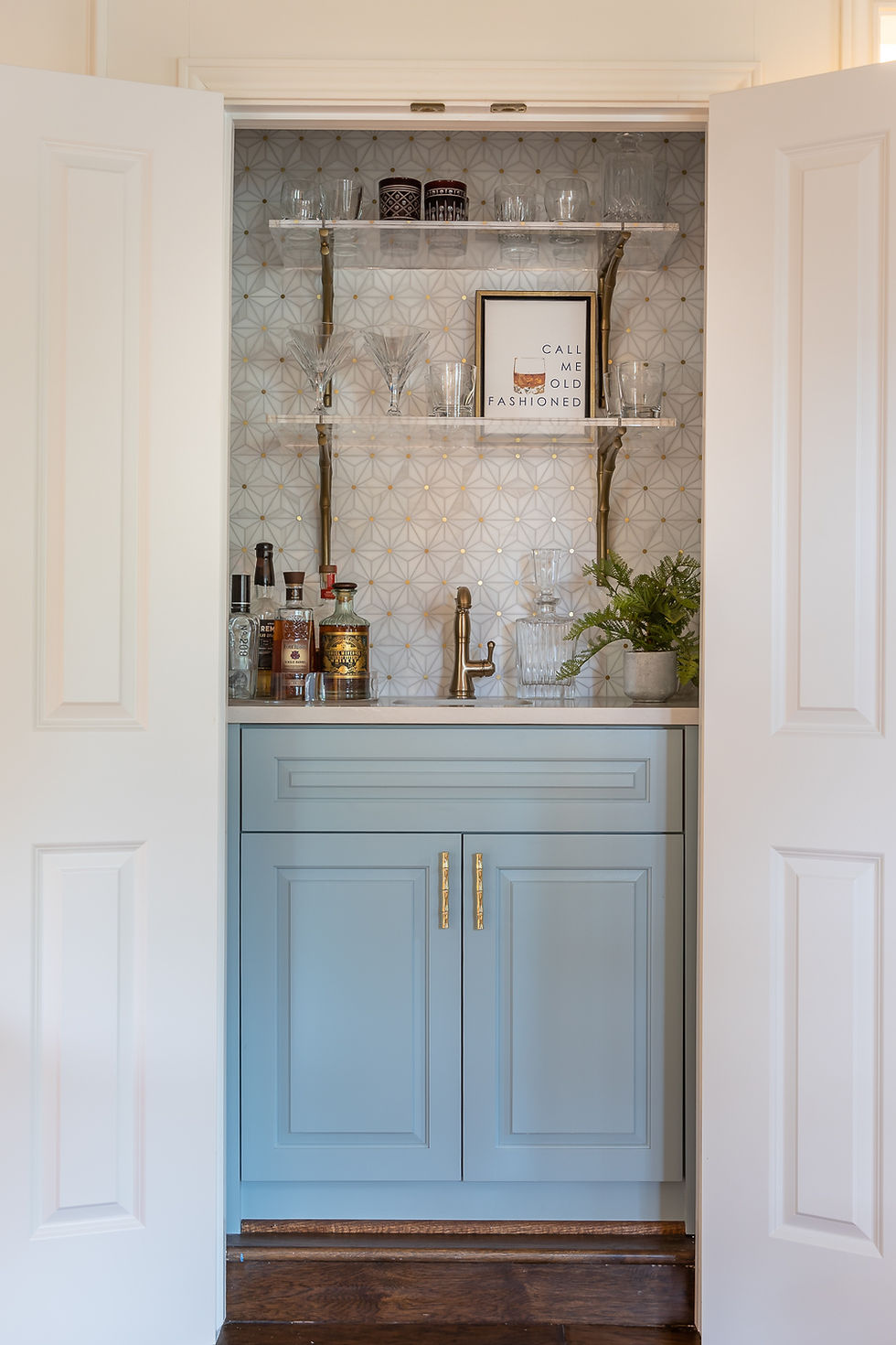
Does the tour have you parched? Let’s stop for a drink.

This little hidden gem is tucked away under the stairwell. The only original feature that remains is the gold bamboo hardware. We added new soft blue cabinetry (and walls), a show stopping marble and brass backsplash, lucite shelves, and a brass sink and faucet.

Our last stop is the dining room. This space before had a small opening to the kitchen. We enlarged it for a better connection between those two spaces.

White wall paneling and soft blue walls (a different blue this time!) are the backdrop to the show stopping features on the ceiling…

On the ceiling, blue and white abstract floral wallpaper, offset with (of all things) an orange chandelier! Definitely not an expected move, but one that completely reflects our clients personality and love of color.

Family heirloom furniture remained, along with a treasured portrait of her Grandfather, which was the jumping off point for the color in the room.

We picked up on those colors in the fabric we used to reupholster the chairs, which echoes the entry wallpaper as well.

And with that room, we turn back towards the kitchen and complete our tour!
We hope you enjoyed this fun and unexpected colorful tour!


Can you provide the name of the paint you used on the wet bar cabinets? Thank you!
Can you provide a link for the rug used. Also, can you please tell me where the lights are from? Thank you!