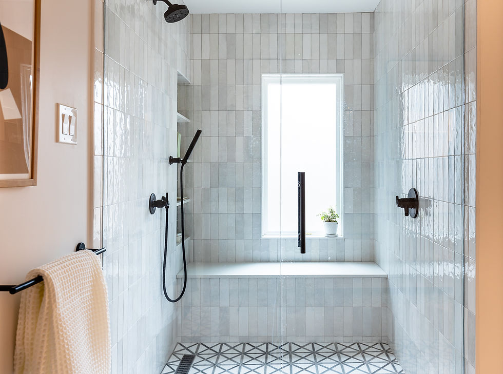
The humble subway tile. We’ve all seen it, in white, as a kitchen backsplash. You can get them for a buck or less a pop. But, friend, there’s something more out there beyond the basic brick-laid-subway tile.
We are going to let you in on a little secret – changing up the standard offset pattern on your rectangular tiles can totally transform your tile situation. On the floor, on shower walls, and on backsplash, we love to mix things up on our projects to take an inexpensive tile (or even an expensive one!) and make it into something unexpected.
Here are our 7 ways to lay rectangular tile that are anything but basic.
VERTICAL OFFSET: THE MODERN TWIST

Think of Vertical Offset as the layout that makes your walls look taller and leaner—like your tiles just came back from a Pilates retreat. This layout is all about elongation and elegance, with a little bit of movement, and is right at home in a modern, contemporary, transitional, or eclectic home. Perfect for those spaces where you want to add a bit of height and sophistication.
VERTICAL STACK: THE MODERN LAY

If you love clean lines and modern vibes, Vertical Stack is your BFF. Each tile stacks directly on top of the other, creating a seamless and super sleek look. It's the minimalist's dream come true. A go-to to draw your eye up and make your space feel taller.

HORIZONTAL STACK: THE MID-MOD LAY

Horizontal Stack is tried and true. Popularized in the middle of the 20th century, and timelessly modern. It’s like your favorite pair of jeans—classic, versatile, and always in style. This layout keeps things neat and tidy and is a great to use with a colorful or patterned tile.

BASKETWEAVE: THE COZY CLASSIC

Ready to weave some magic into your home (couldn’t resist that pun)? Basketweave is a layout that screams sophistication. It has been used forever in design and feels a bit vintage without being overly traditional. Perfect for adding when you want something classic, but not overused.

DOUBLE HERRINGBONE: THE STATEMENT MAKER

Double the herringbone, double the impact. This layout is the bolder version of its singular cousin, and is fun and unexpected. A great choice for a floor where you’ll be able to see a large area of it to appreciate the pattern.
HERRINGBONE: THE TIMELESS CLASSIC

Ah, Herringbone—the darling of tile layouts. This zigzag pattern adds movement and flair to any space without being too over-the-top. Modern or traditional, and everything in between, you literally can’t go wrong here.

ALTERNATING CORRIDOR: THE FUN TWIST

Last but not least, our sneaky favorite, the Alternating Corridor is here to shake things up. This pattern is unexpected and always creates serious WOW factor. This layout alternates rows of horizontal and vertical tiles to create a playful option that adds personality and a modern twist to your home. Every other row can alternate, or you can spread the horizontal bands further apart. So many great options.


Have you tried any of these in your home? What patterns would you add to the list?


Kaiser OTC benefits provide members with discounts on over-the-counter medications, vitamins, and health essentials, promoting better health management and cost-effective wellness solutions.
Obituaries near me help you find recent death notices, providing information about funeral services, memorials, and tributes for loved ones in your area.
is traveluro legit? Many users have had mixed experiences with the platform, so it's important to read reviews and verify deals before booking.
Cupidbaba offers a variety of sex toys including vibrators, dildos, masturbators, penis sleeves, sex dolls, BDSM accessories, and more. They provide products for both men and women, with a focus on enhancing pleasure and intimacy for all preferences.
badtoysinc offers a wide selection of adult toys, including vibrators, dildos, BDSM gear, and more. Their products cater to various preferences, ensuring quality and satisfaction. You can explore unique options for enhancing intimacy and pleasure at their online store.
Adultscare offers a variety of butt plug including different sizes, shapes, and materials like silicone and metal. These toys are designed for both beginners and advanced users, providing pleasure and comfort for anal play and enhancing intimacy.
The creator of the most well-known Scratch Geometry Dash version, along with other iconic Scratch projects.